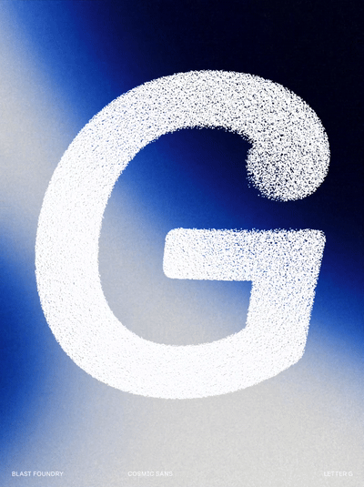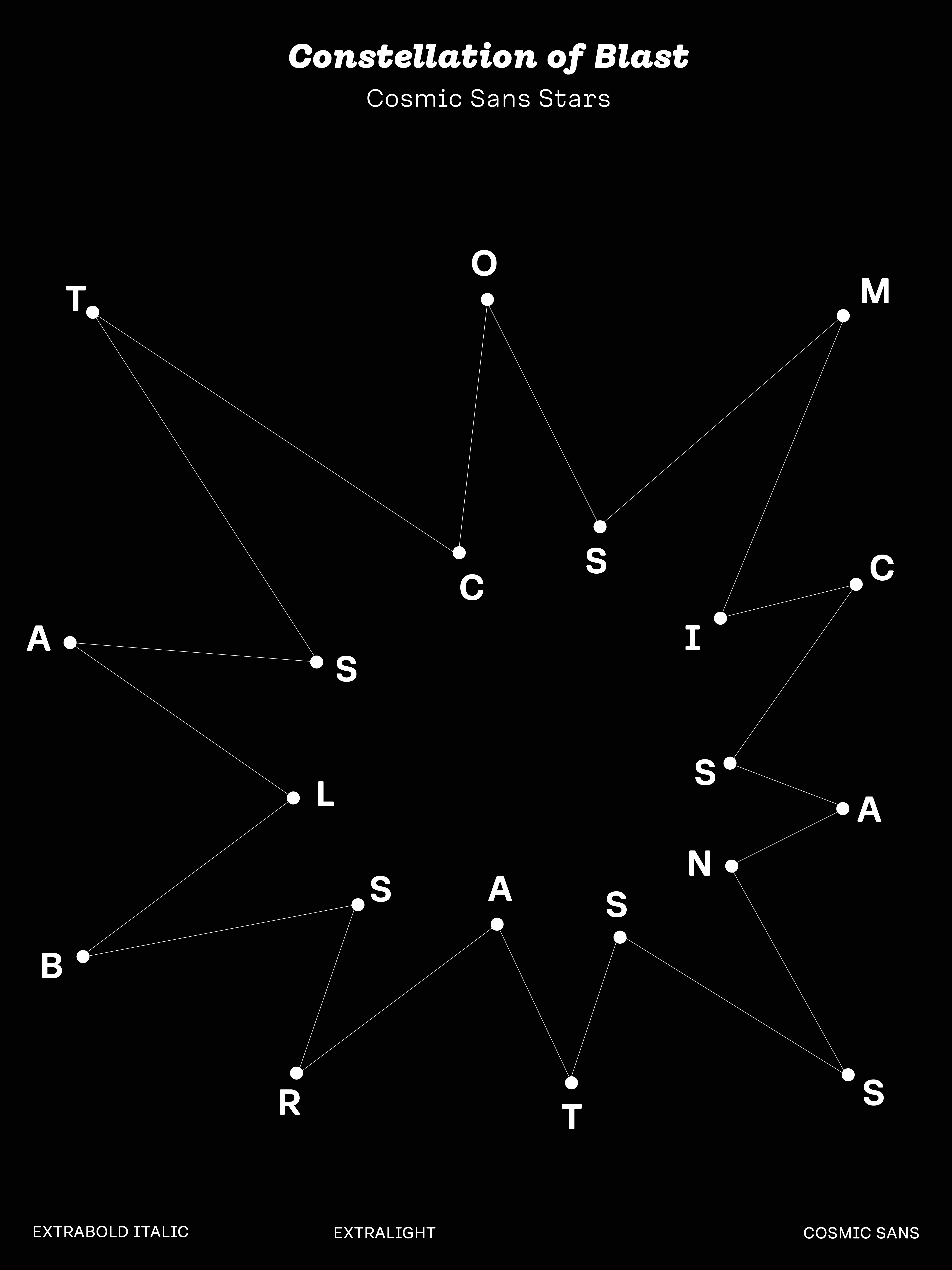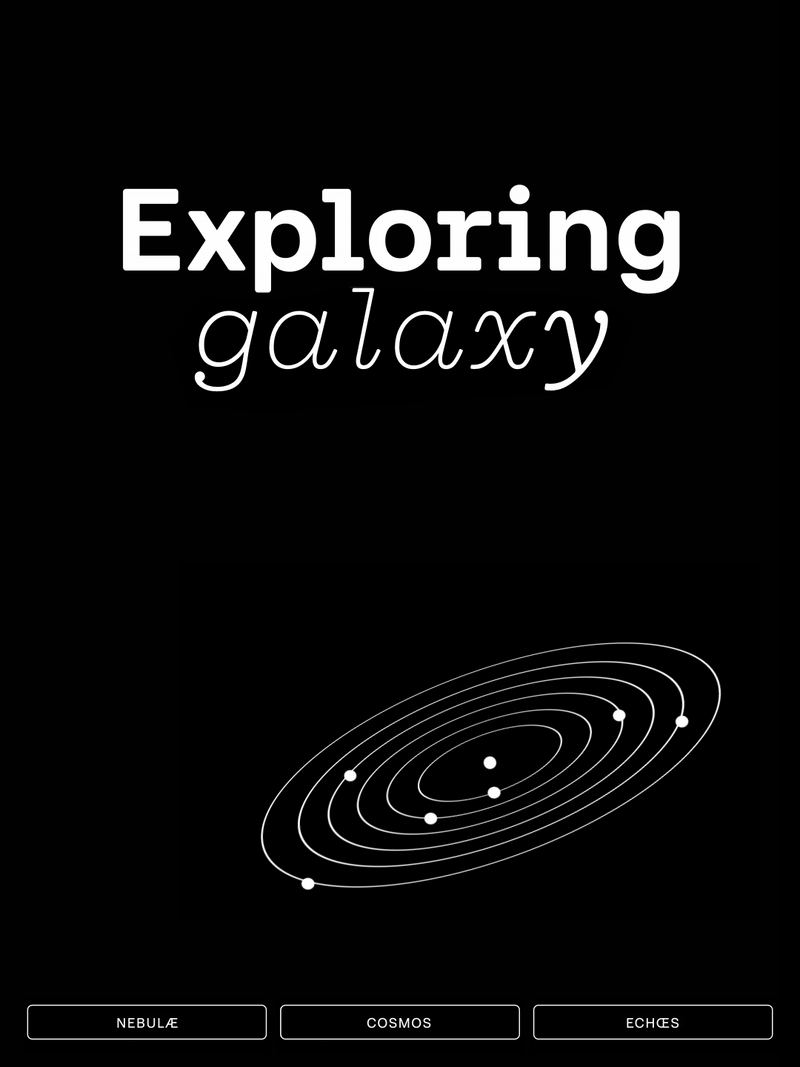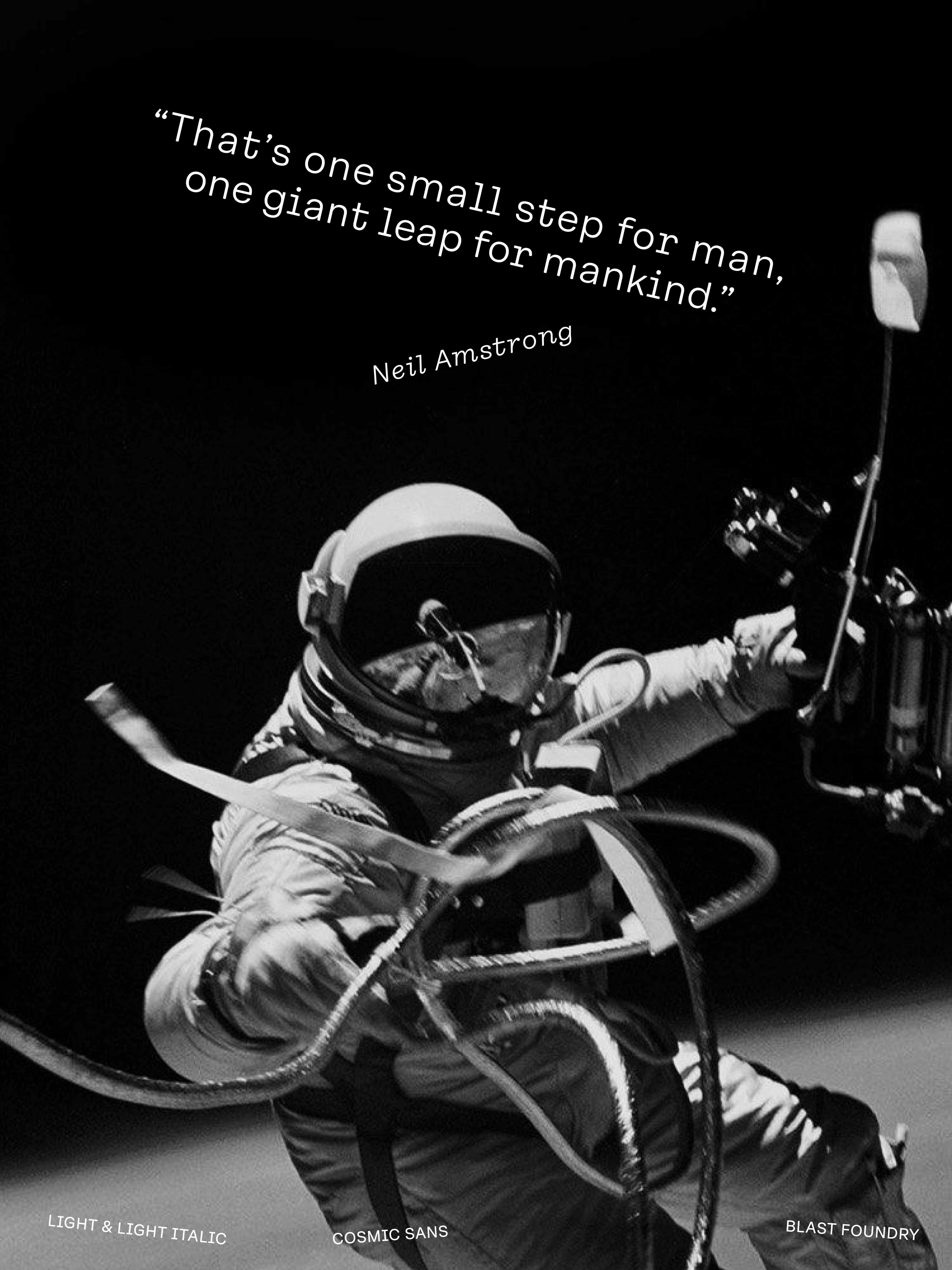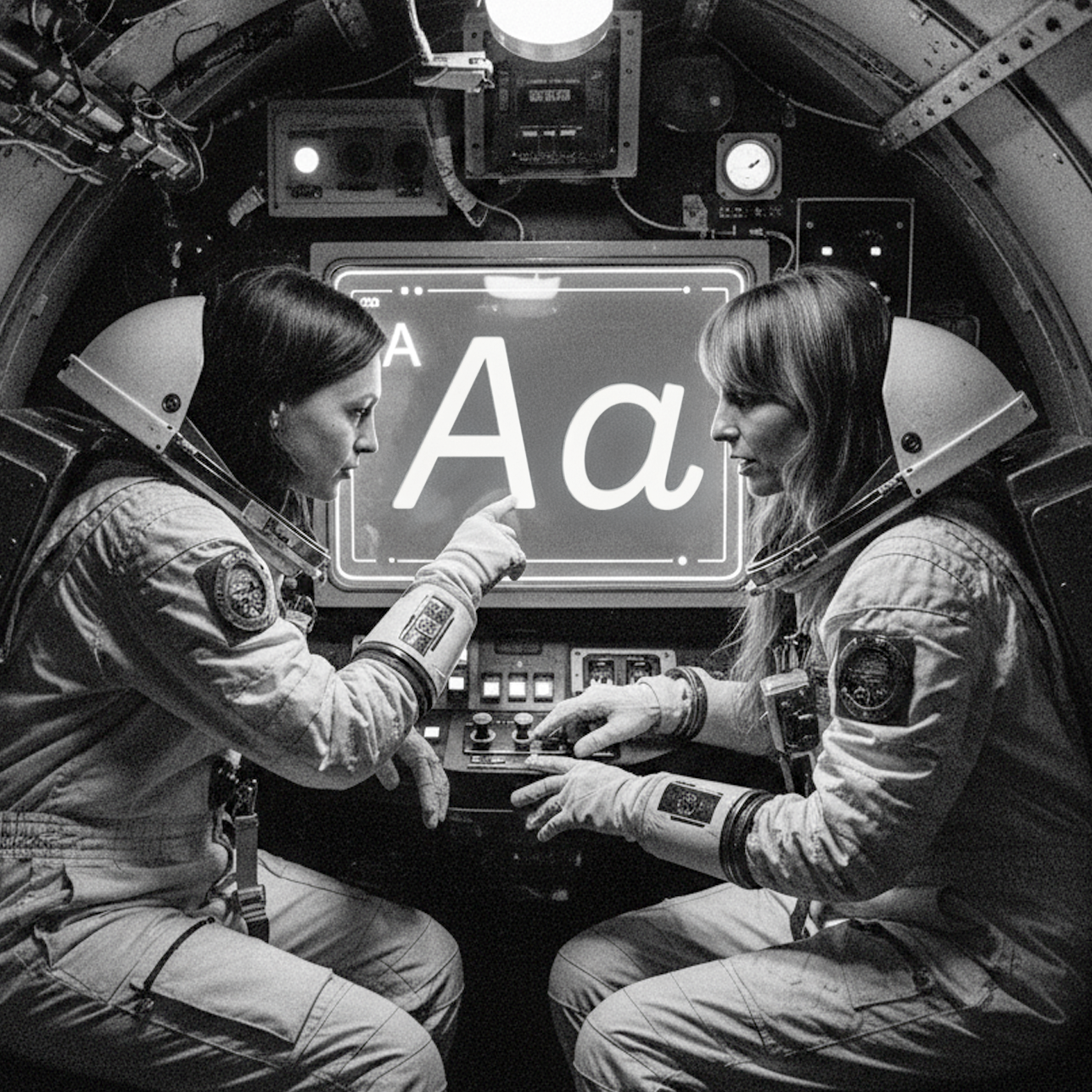


Why is it called Cosmic Sans?
We didn’t design Cosmic Sans with space in mind. It started as a typeface for the cosmetics world. At some point during the process, we began calling it “Cosmetic Sans,” and from there, the name was jokingly shortened to “Cosmic Sans.” It was part pun and part placeholder, but it stuck. Not because the typeface looks like a galaxy, but because it feels like a calm signal drifting through one. It is balanced, curious, and just a little otherworldly.
①⑥
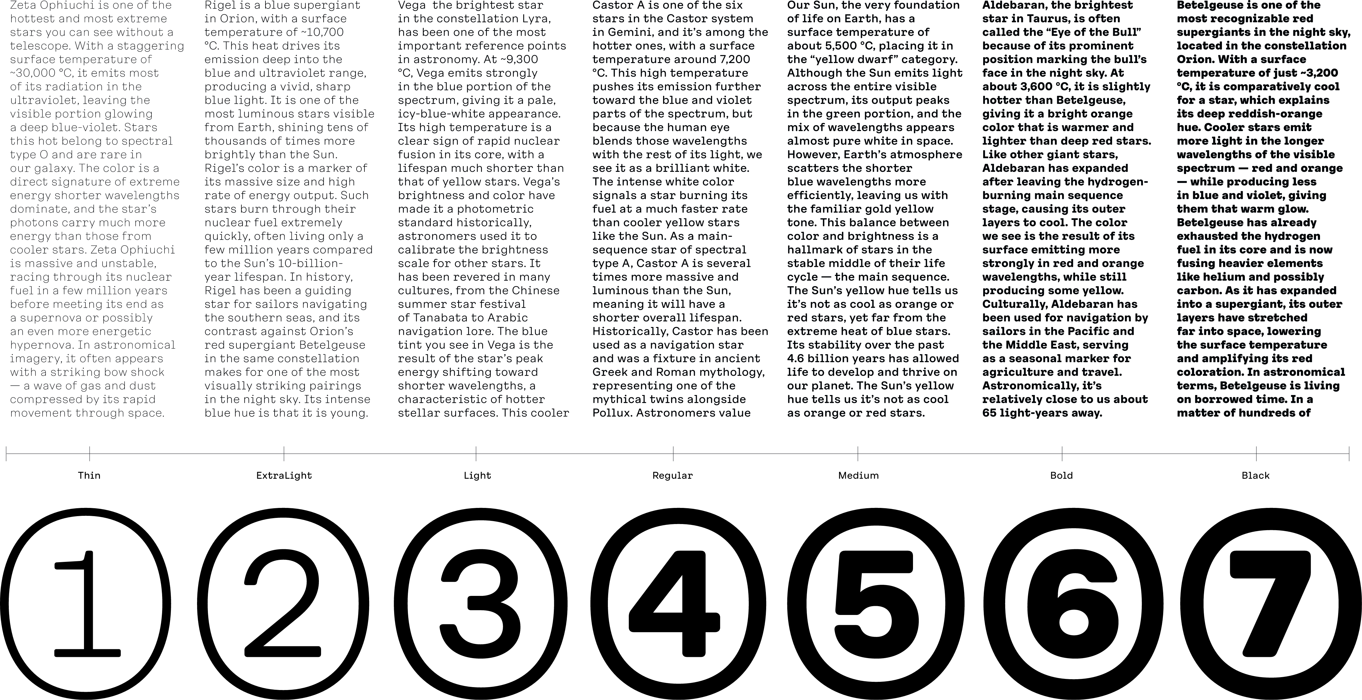
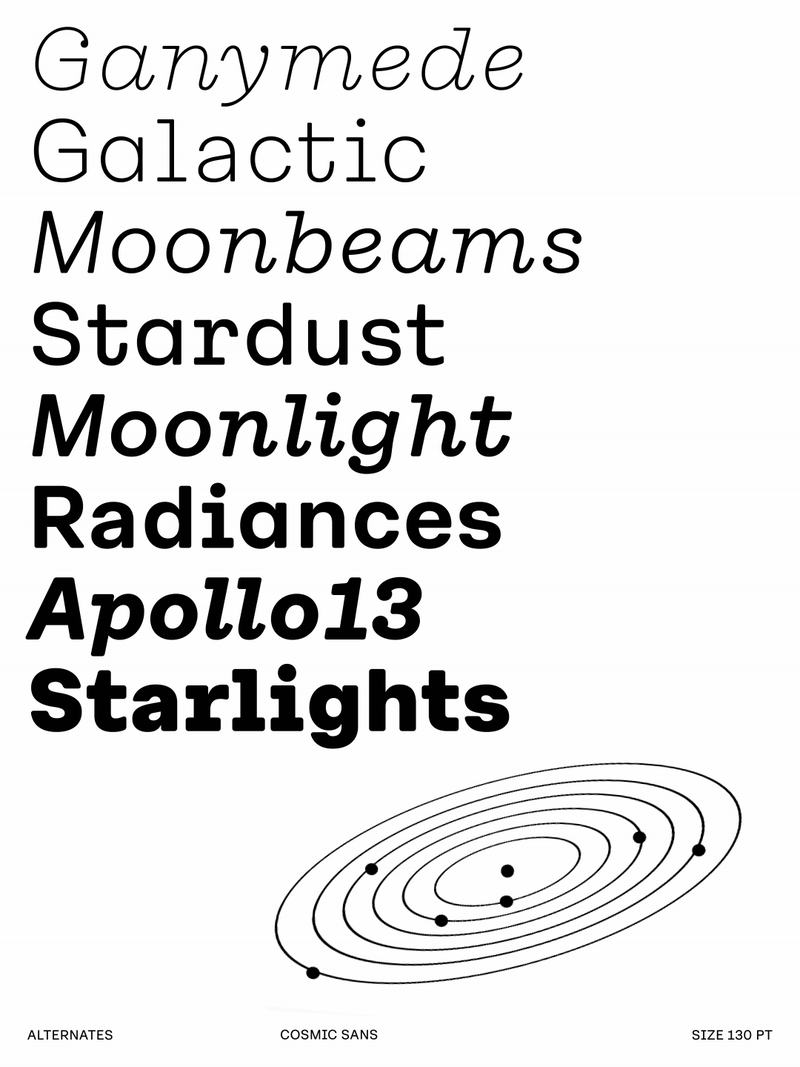
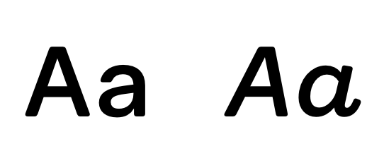
Styles
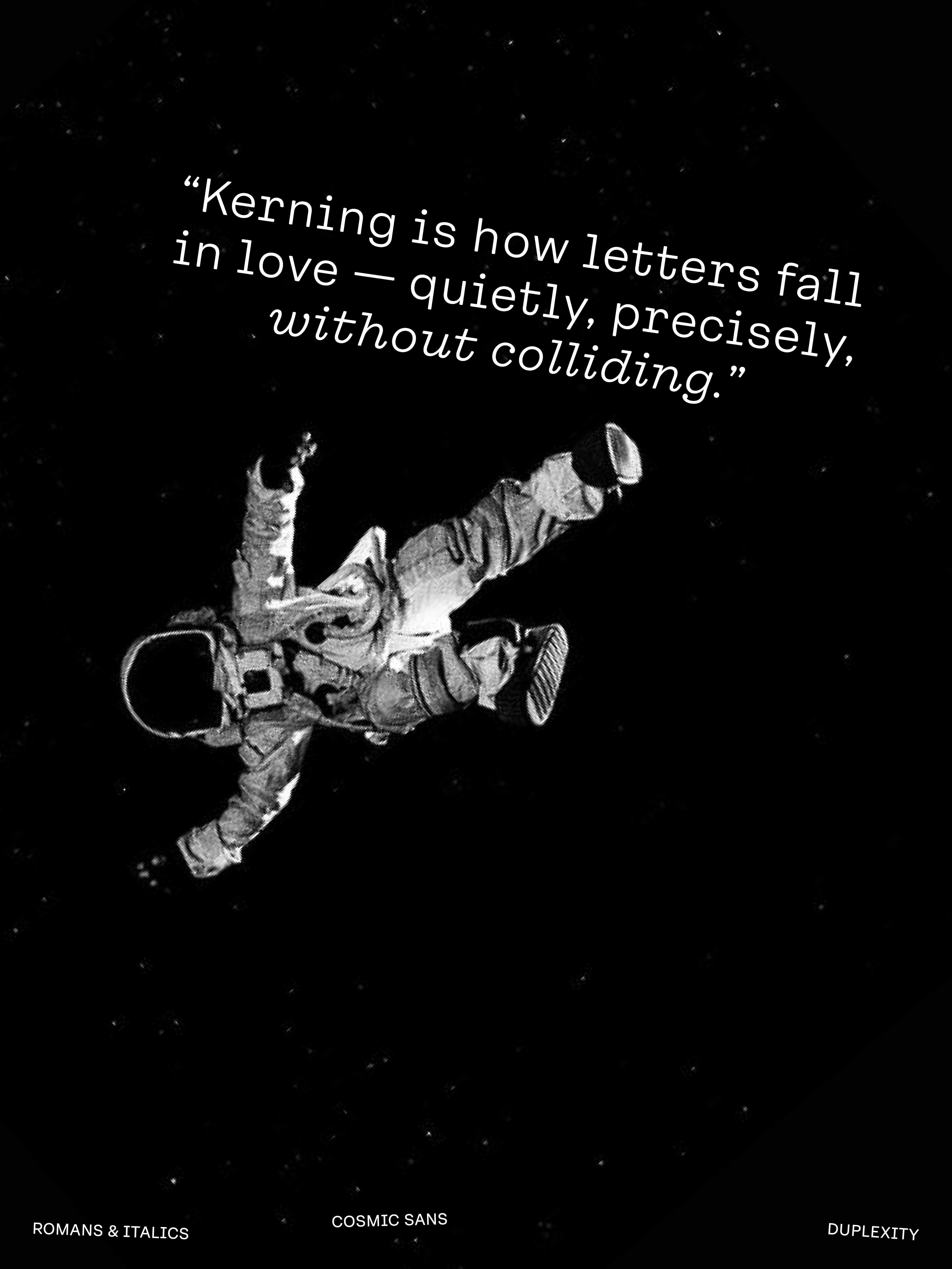
Roman and italics
❽
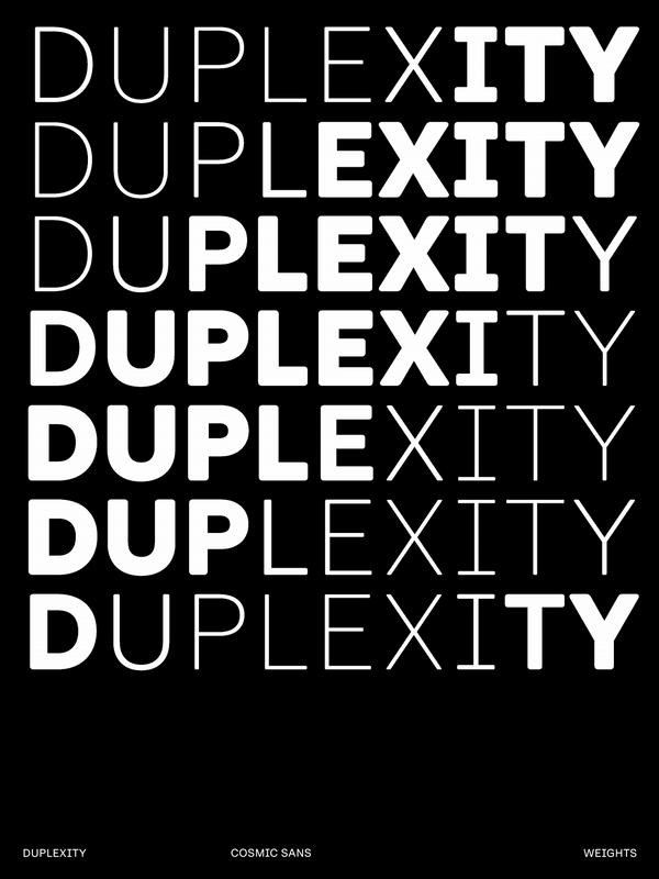
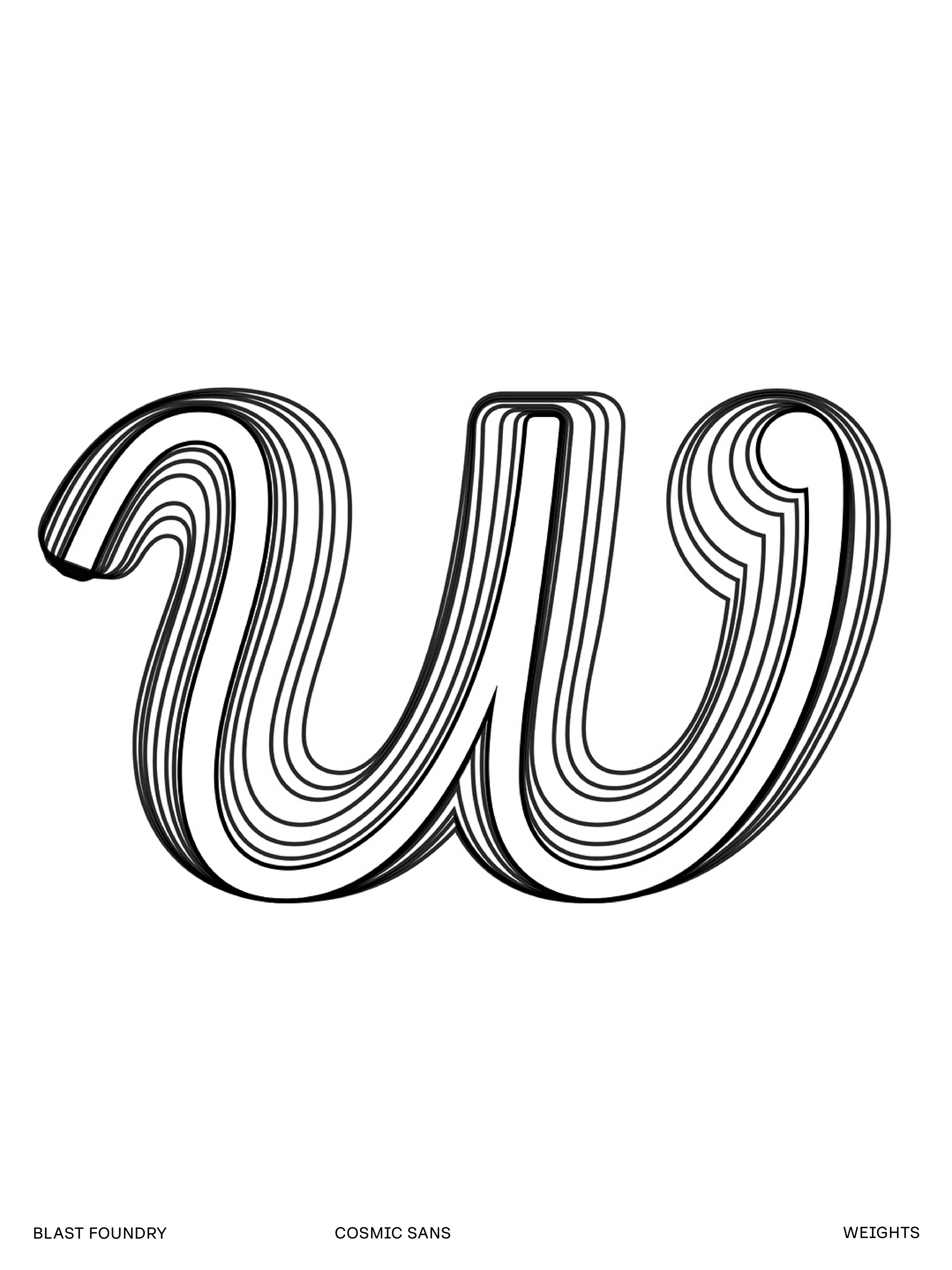
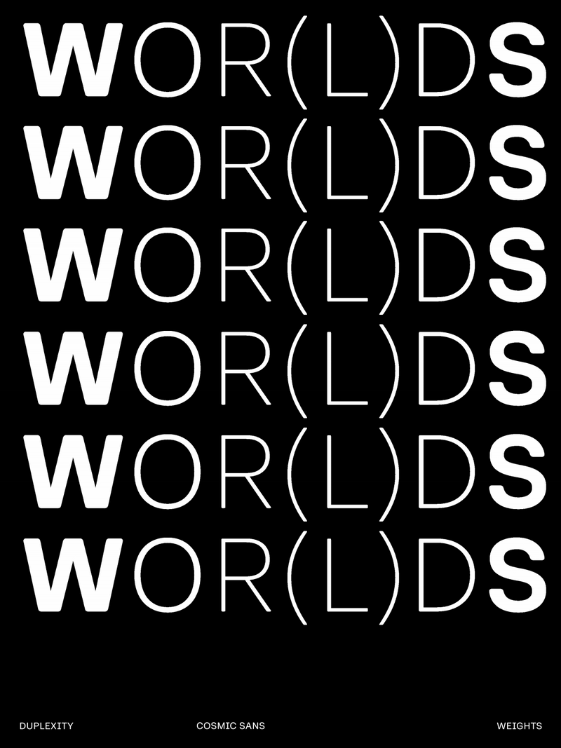
Weights
for each style
⑨⑥+
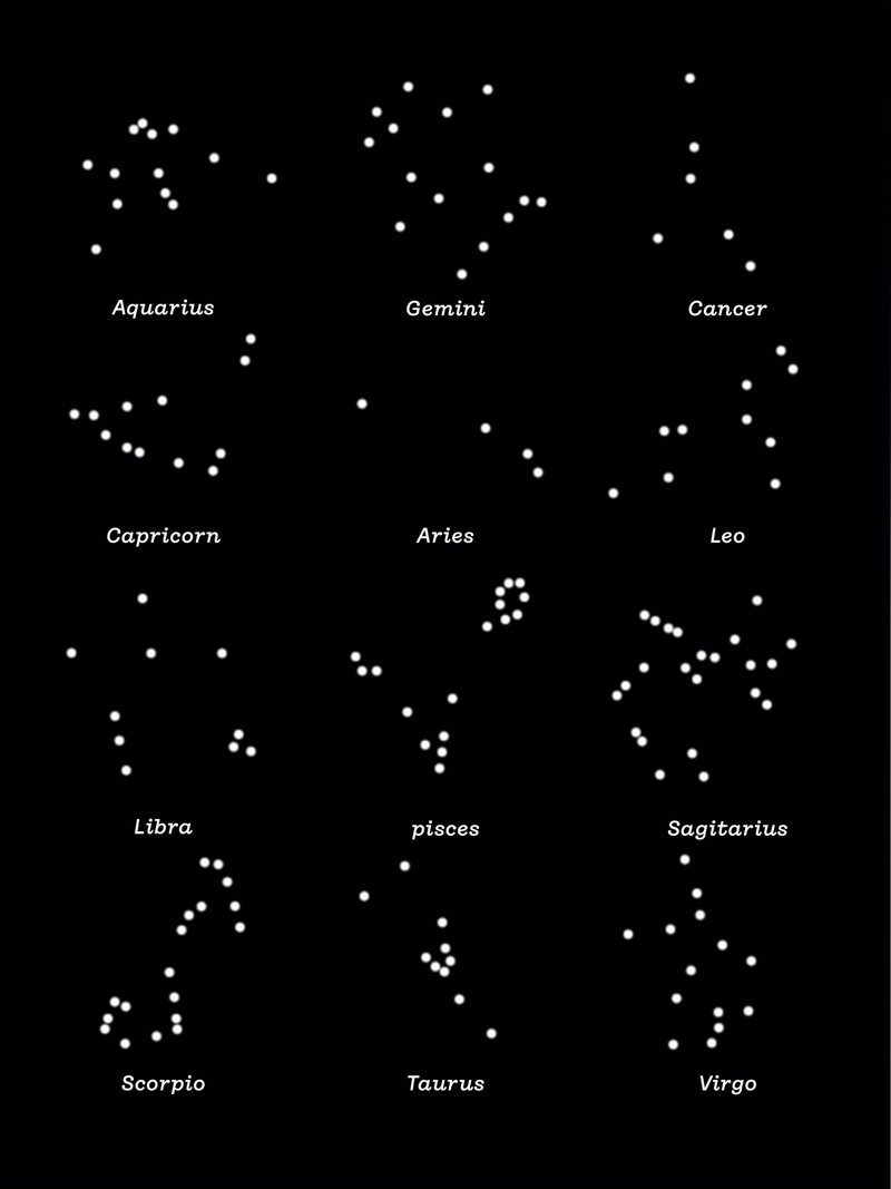
Languages
in Europe & beyond
❺❹❽
Glyphs
for perfect layout
01
02
03
04
05
06
07
08
09
10
02
03
04
05
06
07
08
09
10
Andromeda Halo RA 00h 42m 44s / Dec +41° 16′
NGC 1300 Bar RA 03h 19m 41s / Dec −19° 24′
Messier 82 CoreRA 09h 55m 52s / Dec +69° 41′
NGC 604 Starburst RA 01h 34m 33s / Dec +30° 47′
Centaurus Jet RA 13h 25m 27s / Dec −43° 01′
Sculptor Dwarf RA 01h 00m 09s / Dec −33° 42′
Omega Centauri RA 13h 26m 47s / Dec −47° 29′
Sombrero Rim (M104) RA 12h 39m 59s / Dec −11° 37′
IC 1101 Core RA 15h 10m 56s / Dec +05° 44′
Magellanic ClouD Multiple positions (LMC)